The world would certainly be a boring place without color!

Today, we have a huge variety of interior design color schemes to choose from. Not only are there primary, secondary and tertiary colors (what most of us learnt way back in school), but there are so many shades and tints of each color that choosing a color palette for your home can become daunting.

Breaking It Down – Why Getting Your Colors Right Is So Important

Color is a fundamental part of interior design and can serve so many purposes. It can influence mood, can alter the energy levels in a room and can be used to create focal points within a space.

Interior design color schemes can enhance the style of your home, making it look more modern, contemporary or traditional. Most importantly, the color palette you choose injects the space with your personal sense of style.

img

Using Color To Influence Mood

We know that color can affect our emotions. But, how does this translate to the colors we choose for our homes or offices?

In general, cooler colors such as blues and greens are soothing, whereas bolder reds, yellows and oranges are invigorating.

Whites and light hues such as beige invoke a feeling of purity and freshness, whist black and dark color shades are perceived as powerful and mysterious.

Hence, you might choose cooler colors such as pale blues and greens for a child’s bedroom or a meditation room. On the other hand, you might want to include bolder accents in a home office to get your creative juices flowing.

img

How Color Can Define Space

The colors we choose can alter the perception of a space. For example, we automatically associate a bedroom with a light color palette and pale pink accents, as being more feminine. Hence, you could assume that it was designed for the lady of the house.

Alternatively, we think of black, dark grey and dark browns as more masculine colors. Therefore, a study or a bachelor pad might have a color palette that uses a combination of these colors.

Lighter colors make a room look more spacious and airy. Light colored ceilings increase the perception of height, making a room seem taller. On the other hand, if you paint your ceiling a darker color, it makes the room look smaller and more intimate. Therefore, you might opt for a darker ceiling in a bedroom in your attic, to make it feel cozy and intimate.

img

Creating Focal Points With Color

You can use color to draw the eye to a particular surface or feature in a room.

In classic interiors, we often use white to enhance decorative features such as trims and moldings. Paint trims white against a dark wall to create a crisp, finished edge. Use contrasting colors to make noticeable features, such as a fireplace or an art wall, stand out.

If color can be used to enhance, it can also be used to disguise.

Use your interior design color schemes creatively, to hide imperfections in a space. Using the right color and finish of paint can be a inexpensive way to hide interior flaws.

For example, light, matte-finish paints are a great way to hide uneven wall surfaces. Avoid glossy finishes, which can reflect light and draw attention to flaws. Color conduits, vents or other features the same color as the wall to make them disappear.

A simple rule is to remember that low-contrast interior design color schemes are a great way to hide flaws. Similarly, high contrasting color palettes are best used to draw attention to a particular feature.

img

Enhancing Style With Interior Design Color Schemes

A color palette is also useful in enhancing the style of your interior space. For example, minimalist modern designs often use a neutral color palette comprising of light hues such as whites, beiges and greys.

Use materials such as concrete and stainless steel, with silvery tones, to add a high-tech, futuristic vibe to the interior space. Now add in a pop of color in the form of an accent wall and your design becomes more contemporary. Reflect this accent color in other accessories such as rugs, throws and artwork to create a cohesive design.

Similarly, traditional designs often use warmer color palettes with colors such as browns and ochres. Darker colors are usually used as accents.

Use natural materials such as wood and stone to add a richness to the space. Incorporate stripes or floral patterns, on upholstery or pillow covers, to echo the warmth of the wall colors.

This does not mean that you cannot use red if you have a modern home. It just means that you could use a deeper shade of red as an accent color rather than making it an overall wall color.

Colors That Complement Interior Spaces

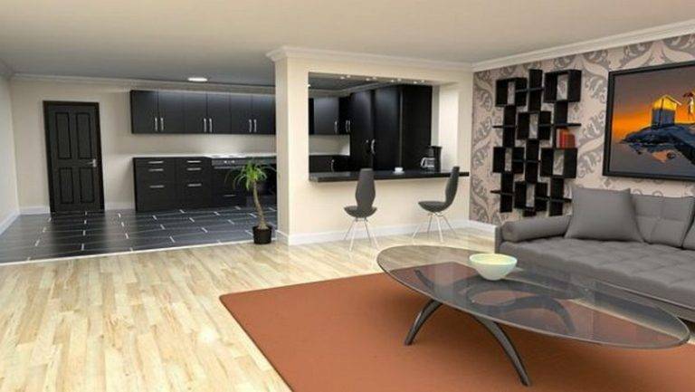
Most clients today prefer open floor plans, moving away from past trends that favored interior rooms divided by walls.

This makes the role of color even more crucial because the chosen color palette needs to tie together spaces with varied functions. Living, dining, entertainment and kitchen spaces need to be visually tied together by color.

With color palettes, you can choose to go either light or dark. Light colors such as white and beige are timeless and work wonderfully to bring different spaces together.

Whites and beiges can be a backdrop for anything. They can offset furniture with rich, dark colored upholstery in a luxurious living room or can be paired with state-of-the-art equipment and lacquered cabinets in a kitchen.

They can also act as a backdrop for a collection of eclectic artefacts or become a canvas for bespoke artwork. White walls can work with dark wooden floorings and just as well with grey concrete floors. White is a truly versatile color and can work with so many different accent colors.

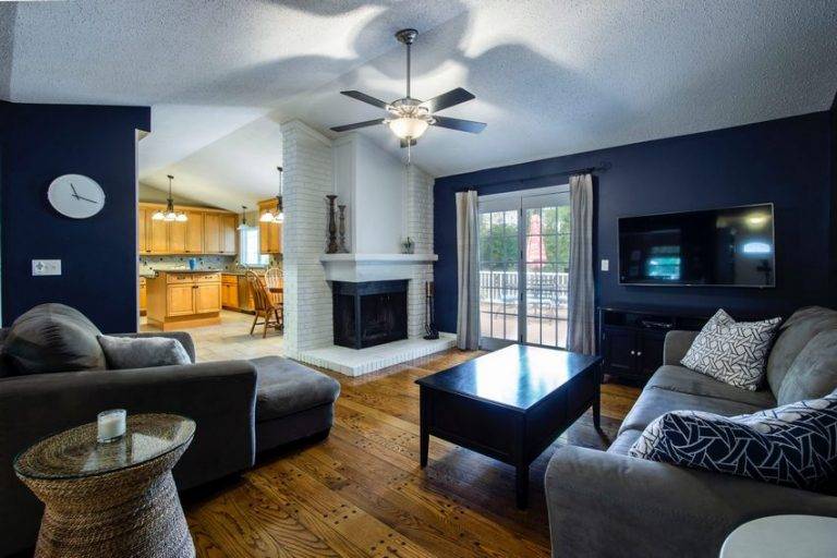
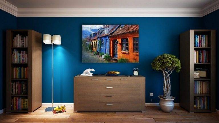
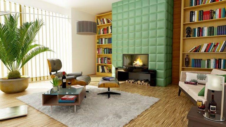
Painting a wall with dark colors such as turquoise, red, ochre yellow, brick brown, dark grey or black is a daring move and adds drama to a room.

The vivid colors make the space come alive. Pair these with light curtains and furniture to counterbalance the dark walls. Darker colors tend to compress a space, making it feel cozy.

They are ideal for reading nooks or studies, where you want the space to appear intimate and inviting. Light accent pieces can draw the eye away form the walls, making you focus on the artefacts instead.


Trending Colors In Interior Design Color Schemes

What are the popular colors that clients are requesting in their interior spaces?

While many people look to popular trends to help them decide on their interior design color schemes, there are some color palettes that are timeless. These never go out of style and their popularity is not really affected by trending colors.

Timeless Interior Design Color Schemes

These are tried and tested colors that have stood the test of time. What makes them popular is their versatility.

They can be used in many different ways to make a room feel soothing and relaxing or vibrant and energizing. They can be used with a variety of accent colors, but are equally effective when used on their own.

As experienced designers, we have worked in the design industry in Dubai for many years. Trends have come and gone, popular paint giants have announced their ‘Paint Color of the Year’, but we have found these colors to be timeless.


Light Grey

Another timeless color, light grey may seem boring to some, but comes in a fantastic range of cool and warm hues that can provide a neutral backdrop for vibrant decor accents.

Pair cool blue-grey walls with rich wood tones for a warm, welcoming interiors. Alternately, use white and pale green accents for a calm, relaxing vibe. You can also brighten up a space, like a sunroom, with brightly colored upholstery that anchors the space.

Whites

Whites have been used in interior spaces for decades and with good reason.

Believe it or not, there are hues of white such as classic bright white, alabaster, egg-shell white and many more to choose from.

A white color scheme can brighten up any space, making it look crisp, fresh and airy. Pair with dark wooden flooring and brightly colored upholstery for a fresh, summer vibe or go more subtle with monochromatic upholstery that is complementary rather than contrasting.

Classic black and white is also a popular color palette. It is elegant and sophisticated. Pair it with a metallic finish to give it a modern vibe. Conversely, use warm tones or contrasting accent colors to make the room look rich and vibrant.

Not really crazy about white? Think it’s too sterile? Then go for tints of beige and taupe.

These bring warmth to an interior space and are equally versatile in their ability to pair up with most accent colors. Go turquoise for a apunky, lively interior vibe or dress up with gold accents for a more luxurious feel.

Trending Interior Design Color Schemes

If you like to keep up with current trends then read on to see the latest trends in interior design color schemes.

As life gets increasingly hectic, more people are turning to their interior spaces as a refuge from the pace and demands of life. Hence, current interior design trends are more mindful of the delicate balance between physical and mental well being.

This also ties in with the blurring boundaries between interior and exterior space. Therefore, contemporary interior spaces have more of an outdoor vibe.

The vibrant color trends of yesteryear are being replaced by softer, more nature-inspired colors such as woody browns, soft greys and forest greens.

Living walls are becoming increasingly popular in indoor spaces and transitional rooms such as patios. In keeping with the importance of sustainability in every aspect of our lives, natural materials for upholstery or flooring are likely to become more popular.

Picture grey-green walls combined with a rich brown wooden flooring and accessorized with tones of deep ochre. The room functions as an interior space, but has the charm of an outdoor room.

Using Accessories Effectively

Walls get the most attention as they are the most prominent surface in interiors. However,  you can add color to an interior design palette in many different ways.

Let’s not forget about alternate wall surfaces (other than paint), flooring, artwork, rugs and other accessories that can make a chosen color scheme come alive.


Upholstery

Use fabrics for sofas, chairs or curtains to accessorize any design style in an interior space. If your color palette is neutral, you might want to liven up the space with colorful sofas and chairs for a cheery vibe.

Roche Bobois have a wonderful range of colorful modular sofas in the Mah Jong collection that can be arranged in a variety of configurations to spice up any room with a fun, vibrant charm.

If bright colors are not really your thing, you can still add a pop of subtle color by using a monochromatic sofa paired with colored cushions. Repeat this accent color in artworks, rugs or other accents within the space, to tie the design together.

The subtle hues still add a pop of color to dress up the room with sophisticated style. The Minotti brand specializes in carefully crafted furniture pieces in neutral hues and shades that add quiet elegance to an interior design color scheme.

Complementary Floor and Wall Coverings

Let’s not forget the role that flooring can play in adding color to an interior design palette.

Current design trends favor the use of complementary materials on floors and walls as an alternative to painting walls. You can go light with Laminam ceramic tiles and complementing white or neutral shades on walls.

For a seamless look, you can also opt to go with large format porcelain tiles in darker shades for both walls and flooring. This gives the room a modern, edgy look.

Wallpaper is another option for wall coverings in lieu of paint or tiles.

Wallpaper can add serious panache to a room. The type of wallpaper you want is a personal choice. Hence wallpaper can communicate your personal style like few other materials can. The right kind of wallpaper can elevate an interior design and set it apart from others.

Wallpapers are available in endless colors, textures and designs, so you are sure to find something that suits the design vibe of your interior space. Omexco manufacture beautiful high-end wall coverings that are sure to add stylistic flair to your space.

Designers often use carpets and rugs to add a finished look to a room.

Carpets can add color to interior design color schemes in small quantities so as not to overwhelm. They are a great way of mirroring accent colors used on walls, in artwork or collectibles.

It is perfectly acceptable if the rug you choose does not match your color theme exactly. Infact, you could spend loads of time looking for a rug or carpet with an exact color match, when all you really need to do is to go with a similar hue.

How Milestone Can Help

At Milestone, we have worked on a huge number of interior designs in every imaginable design style.

Our design team is experienced in using color to create a harmonious design theme, resulting in highly personalized spaces that reflect what you love and want.

Please contact a member of the design team so we can help you decide on the perfect interior design color scheme for your home, office or commercial interior space.